Your money, upgraded: a calmer UPI app, designed in 48 hours
- Figma
- Smart Animate
- Design system
- Prototyping
- Role
- Solo design
- Research, wireframes, system and every screen
- Timeline
- 48 hours
- A sprint I set myself
- Problem
- Cluttered UPI apps
- Ads first, the balance hidden, hard to read
- Stage
- Concept
- Prototyped end to end, not built
- Screens
- About 50
- With Smart Animate between them
- Outcome
- Got me hired
- The project Spotmies hired me on
The problem
Nova is a UPI payments app I designed in 48 hours, a sprint I set myself to try a new kind of product: finance. Before drawing anything, I went through the apps most people in India pay with, PhonePe, Google Pay and Paytm, and kept running into the same three problems:
- ClutterThe home screen is crowded with ads and insurance offers
- Poor hierarchyEveryday tasks like checking your balance hide behind several taps
- Visual noiseColours that don't match, and low-contrast text that's hard to read outdoors
Every choice below had to fit these:
- 48 hours, on my own, from research to a prototype you can click through
- A concept, not a buildSome ideas would take real work with banks to ship
- UPI's own steps stay UPI'sEntering your UPI PIN is handed over, not redrawn
- References from Pinterest, Dribbble and Behance, and iOS 26's glass for the look
The groundwork
Before any colour, I laid the app out as low-fidelity wireframes, with the user flow drawn between them: from the landing page to home, then two ways to pay, by scanning a QR code or through quick send to a friend, both meeting at swipe to pay and the payment done.
The very last step, entering your UPI PIN, belongs to UPI itself, so the design hands over to it there instead of redrawing it.
The decisions
The answer to clutter and hidden balances was to open on what's yours. Home puts your balance and your cards at the top, then the people you pay most for a quick send, and your latest transactions, with no ads or offers in the way. Stats shows your savings month by month.
Home, quick send, transactions and stats, prototyped.
UPI apps already look up your bank accounts from your phone number, but they still have you find your bank in a list and pick your account. Nova reimagines that: once your number is in, every card linked to it is fetched and appears one at a time, and you pull a card down to add it. A new card is typed straight onto the card itself, which flips over for the CVV.
It's a concept: fetching every linked card at once would take real work with banks to build. But it cuts the steps between signing up and paying to almost none.
Pulling in the fetched cards, then adding a new one, prototyped.
Paying starts with the camera on a UPI QR code. Type the amount, pick the card to pay from, and swipe to pay instead of tapping. A tap is easy to make by accident; a swipe takes a moment, so you know you're paying and think before you do. The tick, the amount and who it went to come up at once, and the balance changes with it.
A payment from the QR code to the tick, prototyped.
The craft
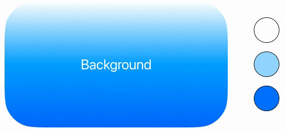
Against the visual noise, one calm look throughout. It starts from iOS 26 and its glass: a blue gradient background with soft blobs of colour, and frosted panels floating over it, in white (#FFFFFF), a light blue (#92D5FF) and a deep blue (#0171FF), with black for text. The whole app is set in Product Sans (Google Sans); the style guide lists SF Pro Display and Plus Jakarta Sans as close alternatives. Buttons, chips and panels are fully round, and the app icon is a pinwheel of blue petals, which opens the screens too.
Colour
Type
Product Sans, for the whole app
₹33,500.00
Regular and Medium only. SF Pro Display and Plus Jakarta Sans are in the style guide as close alternatives.
Shape
One shape, fully round: buttons, chips and the tab bar
The app opens on what it's for, “Your money, upgraded”, with save, spend, invest and pay turning over above it. You continue with Google or Apple, confirm with Face ID, then add your phone number and its OTP.
From opening the app to adding your number, prototyped in Figma.
What makes it feel finished is how it moves. I prototyped it with Figma's Smart Animate, matching layers from one screen to the next so they morph instead of cutting: the words on the opening turn over, a fetched card slides into place as you pull it, a new card flips over for its CVV, and the balance and cards carry through from home into paying.
Getting a morph right means the same layer, with the same name, on both screens, so I built the screens to share their parts. That discipline is also what kept fifty screens consistent in 48 hours.
Cards slide in as you pull them, and flip for the CVV.
To see it the way people would, I placed the finished screens into photo mockups: in the hand beside a card, on a desk, and over a laptop.
The opening, beside a card. Mockups from Mockuuups.
What happened
Nova was never built, but it did its job: it's the project that got me hired at Spotmies, who liked it enough to bring me on.
Nova was my first big personal project, and an experiment. I reimagined a whole app and designed it in 48 hours, which I'd never done before, and along the way I found the techniques and shortcuts in Figma that let me design at that speed.
- What I learnedA tight deadline makes you build a system, because there's no time to draw anything twice
- What I'd changeEven for a concept, show the prototype to a few people who pay by UPI every day, to check it really feels quicker to them